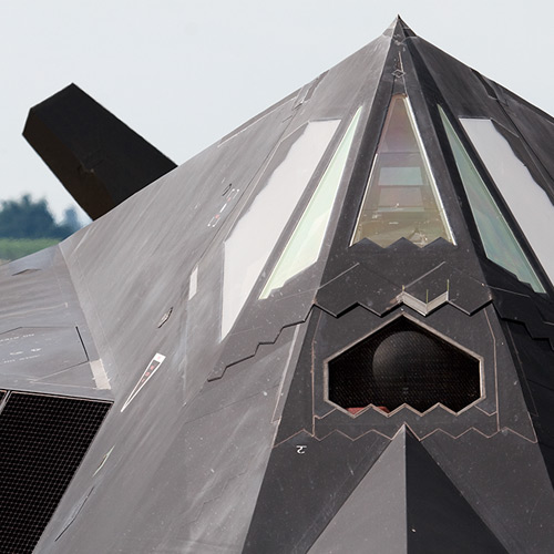
Knight's Watch is a theme with a strong and sturdy aesthetic, bearing a protector-like appeal that consumers can subconsciously register as reassuring – ideal in a world where growing threats to global, national and cyber security create increased discomfort. Like a silent guard, the visual code of this theme communicates strength, resilience, force, power, protection, honor, conduct, security and safety.
Varied Intensity
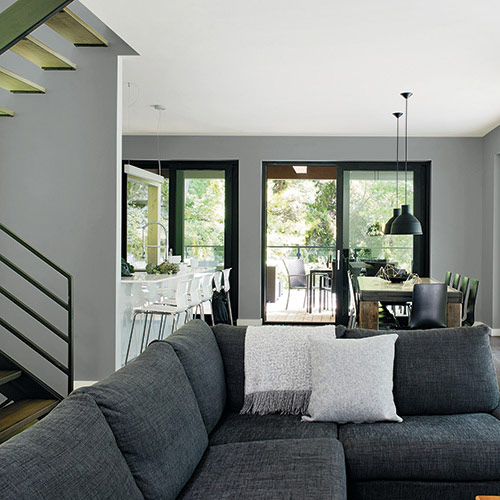
An army of darkened hues, varying in degrees of saturation and intensity, lend serious weight to the force of the palette, while soft off-whites add an element of cleanliness, precision and order.

Boxy and Strong
In architecture and interior design, the look is contemporary, boxy and strong. Industrial metal cladding, stone and concrete are favored over stuccos or woods, yielding a "modern fortress" style. Machinist and industrial design references get a cleaner, edgier look. From industrial-style mesh to sandblasted finishes, expect metals to be at the forefront across all design categories.

Beauty in Opposition
Extreme darks oppose crisp lights or intense golds. Calculated and angular forms are juxtaposed against fluid, organic ones. Thick slabs of wood contrast slim sheet metal. Despite the divide, the look is strong and unified.